
Graphic Designer · Brand Identity · Editorial
MARCUS VAEL
Crafting visual systems that signal intent before a single word is read.
Scroll to explore
01 / INTRO
Crafting visual systems that signal intent before a single word is read.
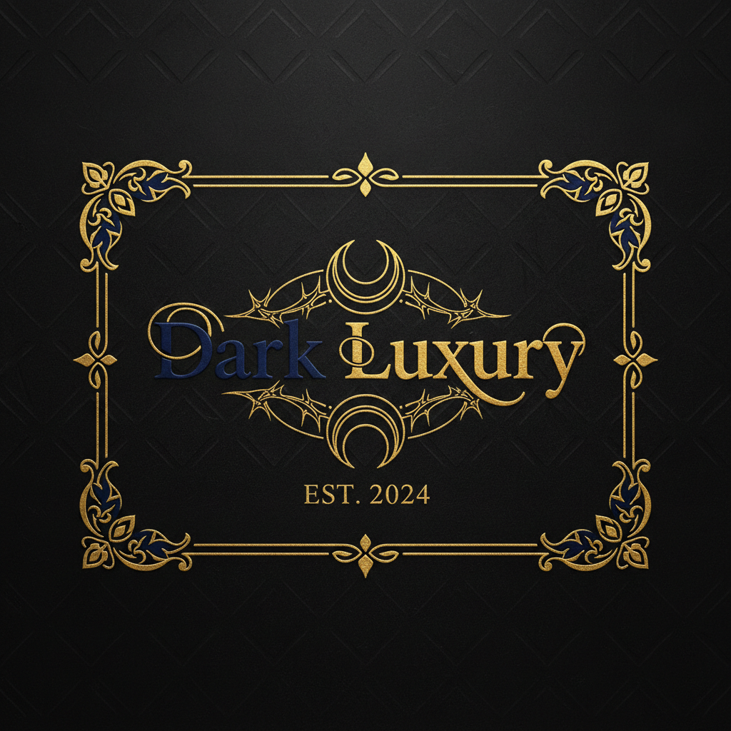
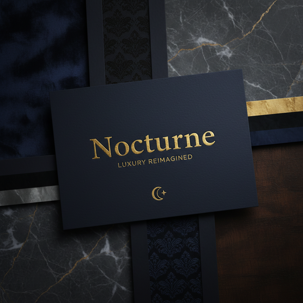
A luxury nightlife venue needed a visual identity that could live in the space between sophisticated restraint and electric anticipation. The mark is a single letterform distorted at the exact frequency of a subwoofer.
Process Notes
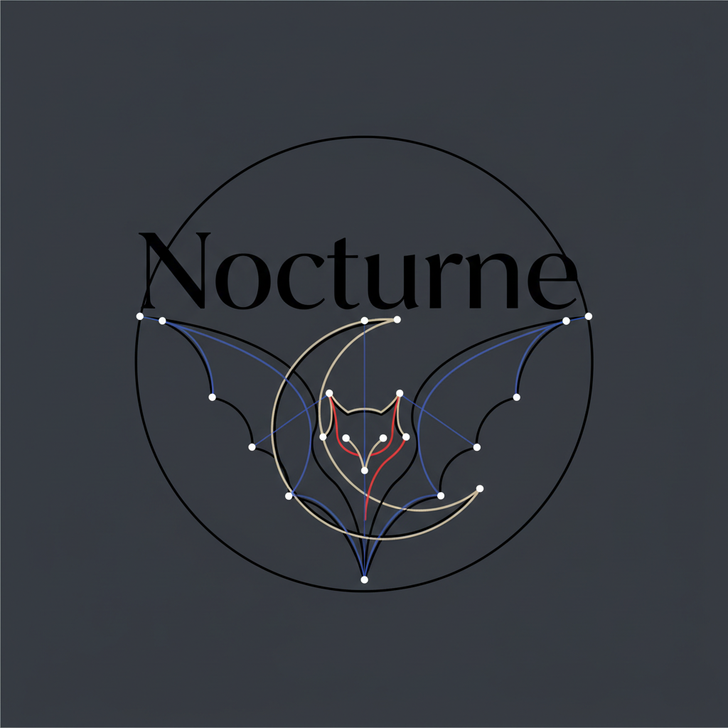
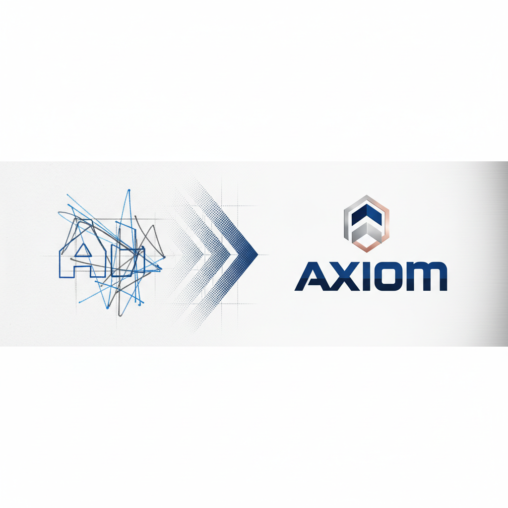
Every mark begins in pencil. The digital translation preserves the original weight decisions — nothing is smoothed that shouldn't be smooth.
"The identity Marcus created didn't just represent our brand — it became the brand. Every touchpoint now carries the same tension we put into our programming."
Raphael Sørensen
Creative Director, Nocturne Group
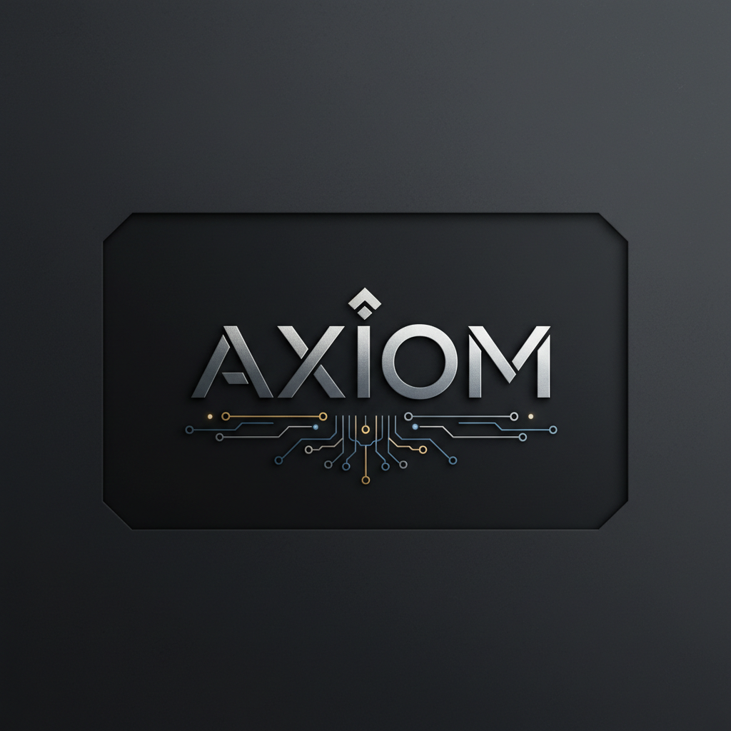
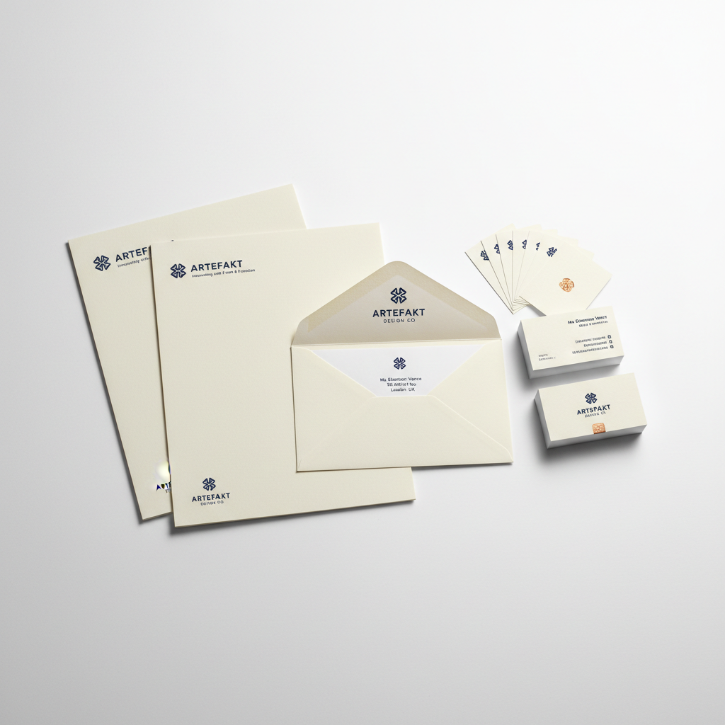
Thirteen days before their Series A pitch. The founding team had a product that worked and a deck that didn't. The new identity was built to communicate precision and institutional credibility in the same breath.
Process Notes
Every mark begins in pencil. The digital translation preserves the original weight decisions — nothing is smoothed that shouldn't be smooth.
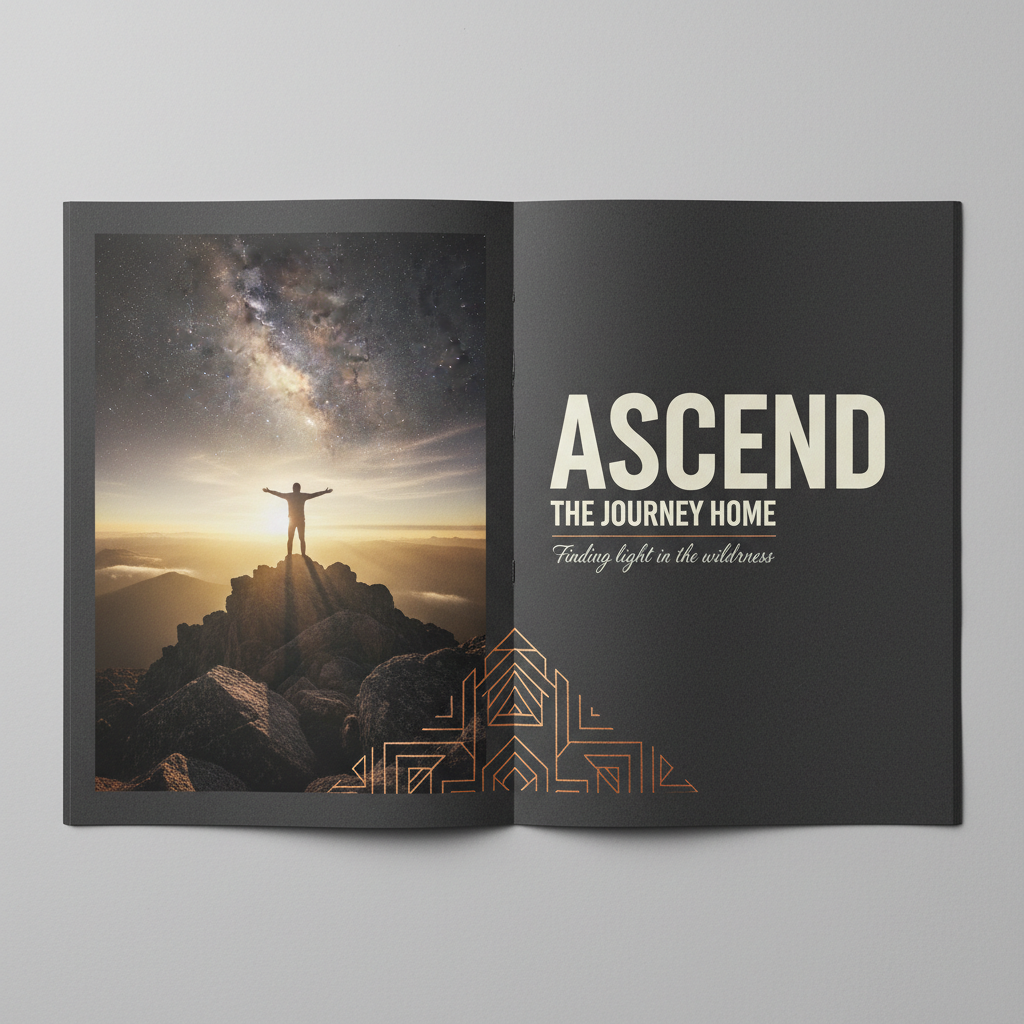
A quarterly publication covering architecture and built environment needed a type-led system that could hold 15,000-word essays alongside single-image spreads with equal authority.
05 — BEGIN
Scroll down to reach the contact form ↓
03 — CAPABILITIES
Five disciplines. One through-line: visual decisions that carry weight before the copy lands.
Visual systems that carry institutional weight from day one. Wordmarks, color architectures, and motion guidelines built to last a decade.
Publication systems where type does the heavy lifting. Grids that hold 15,000-word essays and single-image spreads with equal authority.
Design languages for interfaces where every pixel decision compounds. Component libraries, design tokens, and interaction frameworks.
Campaign and cover art for editorial teams who know what they want but need a visual language to say it.
13-day sprint. Identity, pitch deck, and investor materials — designed to close the room before the product demo begins.
05 — BEGIN
Projects that require restraint, precision, and a willingness to let negative space carry the weight.
A 40-page PDF case study on the Nocturne identity — from brief to delivery.